Client:
Optus
Studio:
Re – M&C Saatchi’s brand consultancy
Role:
Identity design
Retail lead
Retail design direction
Guideline creation
Rollout
Credits:
Mathieu Reguer (Advertising), Marco Palmieri (Typography, Character design), Marco Palmieri/Nexus (Animation), Make (Digital).
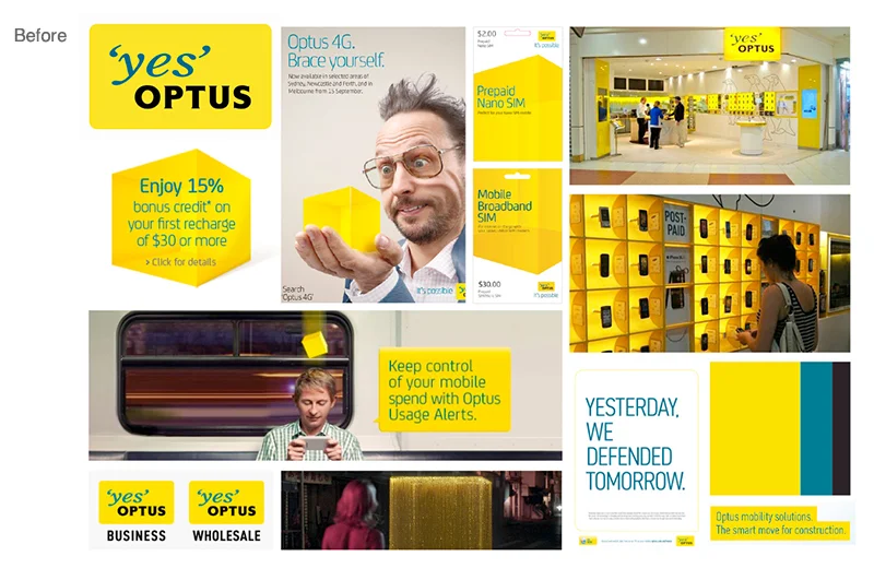
Optus began 21 years ago as the Australian challenger telecommunication brand with a clear purpose: to be the people’s champion in an industry dominated by just one major player. However after many years of success, it became apparent that the customer loyalty they had been so famous for was now in a dire state. Optus realised they needed to bring back a greater level of humanity to what they did and how, in order to win back their customers’ heads as well as their hearts.
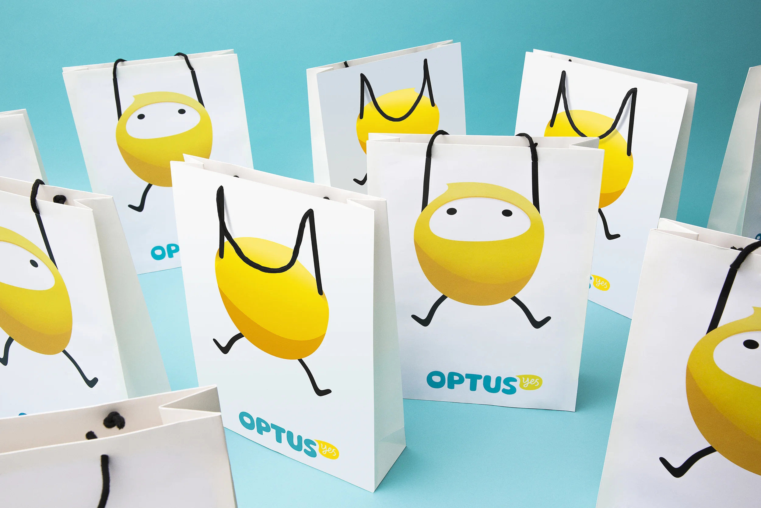
A new attitude: The Wingman. A fresh ‘Wingman’ attitude was introduced, leveraging the existing Optus 'Yes' proposition with a declaration of what this means for a revitalised, customer-focused service brand. The new identity is designed to build greater positivity, optimism and emotional connection with customers.
Within retail, white space and strategic colour-blocking maximised existing store layouts to create a more focused experience that highlighted customer service rather than information overload. The refreshed tone of voice – one that is easy to understand and peppered with a relaxed humour – worked with new information systems to change traditionally complex information into simple and human messaging. Ollie, Optus’ Wingman, featured playfully as a digital-only guide to avoid imposing as the overbearing mascot.
Awards:
Desktop Magazine Create Awards 2014 Project of the Year & Best Brand Identity
Finalist in Australasian Writers & Art Directors Association (AWARD).


